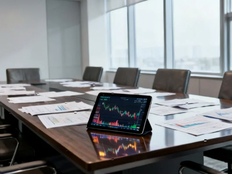
According to TechCrunch, Apple is releasing iOS 26.2, which includes a new slider to control the transparency of the Liquid Glass effect specifically on the Lock Screen clock. This follows the release of iOS 26.1, which introduced a broader opacity control for Liquid Glass elements system-wide. The design language, launched with iOS 26, makes interface elements semi-transparent and light-refractive, but many users complained it made their iPhones difficult to read. The update also arrives shortly after Apple confirmed the departure of Alan Dye, the design executive behind Liquid Glass, who is leaving for Meta. Beyond the design tweak, iOS 26.2 adds features like temporary AirDrop codes, offline lyrics in Apple Music, and AI-generated podcast chapters, alongside important security patches for an active hacking campaign.


A Design Retreat in Slow Motion
Here’s the thing: rolling out a major design overhaul and then immediately giving users tools to undo it is a pretty clear signal. It telegraphs that Apple isn’t fully standing behind Liquid Glass “as is.” First, they gave us a global frosted-glass dial in 26.1. Now, in 26.2, we get a specific dimmer for the Lock Screen clock. It feels like a controlled retreat, admitting the initial implementation was too aggressive for daily usability. And the timing is impossible to ignore. The lead designer, Alan Dye, just left for Meta. His replacement, Stephen Lemay, comes from a background in interface and interaction design—exactly the skill set you’d call in to fix a design that’s tripping up users. Coincidence? Probably not.
More Than Just Glass Tweaks
Look, the Liquid Glass saga is fascinating, but iOS 26.2 isn’t just about that. The temporary AirDrop code feature is a smart, practical addition for workplaces or events. Becoming a “known” contact for 30 days solves a real pain point. AI-generated podcast chapters? That’s a quiet but hugely useful quality-of-life upgrade. And the security patches are the real unsung hero of this release. Apple doesn’t detail the active hacking campaign, but pushing out fixes across all its flagship products on a Friday suggests it’s serious. Basically, while everyone’s focused on the shiny (or less shiny) glass, the update is packing some substantive stuff under the hood.
What This All Means
So what does this series of tweaks tell us? It feels like Apple is trying to have it both ways. They want to push a modern, forward-looking aesthetic—one that maybe prepares for a world of AI smartglasses, as they’ve hinted—but they can’t ignore the loud feedback from people who just want to read their notifications clearly. The solution? Make the bold design the default, but bury the “off” switches in settings. It’s a compromise. But it also raises a question: if your visionary new design needs immediate, user-facing corrective tools, was the vision a bit myopic to begin with? For a company that famously champions cohesive, top-down design, this feels unusually reactive. It’s a fascinating case study in user feedback forcing a giant’s hand.